| Author |
 Topic Topic  |
|
gmac
The Scottish Admin

United Kingdom
5319 Posts |
 Posted - 29/04/2011 : 22:01:08 Posted - 29/04/2011 : 22:01:08


|
quote:
Originally posted by Ailsa
Mamma designing a website is easy but you really need to know what your doing and this site is unimpressive.
Ailsa I have had enough, you have nothing helpful to say and just being argumentative just stop posting in this thread now
No responses to Ailsa post please thank you |

 |
 |
|
|
MsThomson
Hatchling

United Kingdom
134 Posts |
Posted - 29/04/2011 : 22:14:25

|
At 16 I wouldn't have had the get up and go to do anything like that! If youre designing a website yourself without getting a professional involved then unless you've had training it is a bit of a process! I've only had mine a few months and I change it all the time! I'm pretty sure�in fact, I know, that mine looks less professional than some. But crikey you gotta start somewhere! If my eldest who is 18 created their own business I'd be proud as hell. I think any young person who gets off their butt and actually does something like this deserves a round of applause.
And Irv2307� if your offering your analytics experience around I'd love a wee hander too! :D (might as well ask eh!) |
 |
Edited by - MsThomson on 29/04/2011 22:15:15 |
|
|
|
animalcrazy
Hatchling
United Kingdom
327 Posts |
Posted - 29/04/2011 : 22:15:55
|
I teach 16-18 year olds a-levels and do wish a few more of them had your ambition. Good luck with your venture. I look forward to browsing the site more when it's complete.
|
 |
|
|
|
ozziesmum
Yearling

United Kingdom
736 Posts |
Posted - 29/04/2011 : 22:16:20

|
| Very nice and uncomplicated, there will always be a couple of snags that crop up and need ironing out. Can't wait to see it develop well done. :) |
Jane.
Oscar Black Lab, Saffron, Merlin and Mischief the cats, assorted fish, Rhubarb & Custard the corns, Tuppence the Tortoise, Tripod the Leopard Gecko.
|
|
|
|
Kehhlyr
ǝʞɐɔ sǝʌoן
United Kingdom
8173 Posts |
Posted - 29/04/2011 : 22:16:41

|
quote:
Originally posted by gmac
...No responses to Ailsa post please thank you
I do apologise Gmac, but I am going to just this once.
quote:
Originally posted by Ailsa
.....designing a website is easy but you really need to know what your doing and this site is unimpressive.
It's better than another certain website that I'm aware of that may have something to do with a certain flour and egg based product. Thanks!!!
I shall now leave this thread back in the capable hands of Gmac. |
-=Kehhlyr - The Resident Loon
 |
|
|
|
ptmbradley
Yearling
United Kingdom
676 Posts |
Posted - 29/04/2011 : 22:28:20
|
OK I spotted a few more errors. Only slight but it detracts from a professional image. Competitive, stocking, amend are all spelt incorrectly on there. Thank you written as one word, and a few commas that would read better as full stops. Like I said, just simple things. But important for a good image. 
edit: seen more. Spelling, punctuation etc. I think you really need to get the site proof read properly by someone.
Not having a dig. Just trying to help out a bit.
Pete |
Corns: 1.1 Anery, 1.1 Butter, 1.0 Carolina, 0.1 Hypo, 1.1 Snow, 1.0 Sunkissed
Boas: 0.1 Arabesque, 1.0 Brazilian Rainbow, 0.1 Crawl Cay, 1.1 Hogg Island X, 0.1 Hypo Hogg, 0.1 Kahl Albino (poss coral)
   |
Edited by - ptmbradley on 29/04/2011 22:32:02 |
|
|
|
Ailsa
Banned
United Kingdom
804 Posts |
Posted - 29/04/2011 : 22:33:49
|
| G i am not being argumentative, if your going to post a business website as up and running then it should be designed to a professional standard or else what is the point. However, I will apologise and keep it shut from now on. |
  
Dakota ~ Bloodred Corn ~ Amber & Chloe ~ Cats
Mind is changing on snakes I want now lol so am researching these to find out what would be best - Milk Snakes and Dwarf Boa possibly - Crawl Cay, Sonoran, Tarahumara or Vera Cruz and poss a Hoggie, African House and Rat snake. Also Trinket Snakes. |
|
|
|
Diesel1994
Hatchling
United Kingdom
338 Posts |
Posted - 29/04/2011 : 22:54:36
|
| yeh it will all b spell checked soon and images added etc |
Owner of Renza Exotics - www.renzapets.co.uk
For all your Exotic & Domestic pet needs |
|
|
|
Spreebok
Sub Adult

United Kingdom
1135 Posts |
Posted - 29/04/2011 : 22:57:52
|
Few other ideas for you!
It might be a good idea to change the 'reptile shipping' banner picture from a picture of a box with 'fragile' on it designed for glassware to a box that would actually be suitable for livestock transport, as people may get the wrong idea.
The grey text on the front page is hard to read on the green background. May I suggest full black, or even white?
On the vivarium part of the banner, if you size the word 'Vivariums' up to fill in the gap it may look better, or even if you just popped a picture of a smaller viv in the gap. |
|
|
|
eeji
The Morph Master

United Kingdom
4335 Posts |
Posted - 30/04/2011 : 13:55:08
|
yup, its a bog stock shopping cart site just like all the others. If the design is easy on the eye and its easy to navigate those are the most important things.
I have only two minor criticisms, the black on dark green isn't the easiest to read and in the footer you have a mobile number and free email address as contacts. I know this will most likely be sorted eventually but it doesn't instil confidence and trust in a site as it is.
....and will people give the guy a break! who cares what section its in (the correct one btw), who cares if theres no products there yet, he's asking for general feedback not a full blown review of his shop. Only time will tell whether it will be successful and I wish you all the best with the venture, it takes balls to step out and start up a new business especially while times are hard for everyone atm. |

Forum - Guide to Cornsnake Morphs - Punnett Square Calculator - Breeder Directory
|
|
|
|
Sammysnake
Yearling
United Kingdom
606 Posts |
Posted - 30/04/2011 : 15:25:32
|
Hi there and well done for beginning this. There�s a lot of hard work ahead of you and I wish you luck. Here are the things that leapt out at me after giving the site a really quick look.
I started by listing some proof-reading corrections for the main pieces of text but there really are too many and on every page. When I used to work on magazines we had two people with an excellent eye for detail and spelling skills to proof-read each piece of writing and they had to be people who were not involved in producing the text. When you've written it yourself it can blind you to some of the errors. For me, spelling errors always send up a red flag about the trustworthyness (not a real word!!) of a site so it�s really important to get it right. The spelling across the site is really bad � sorry!
It says you have 'numerous qualifications and years of experience'. This immediately raises the questions � which qualifications, how many years of experience and gained where? The fact that an answer isn�t provided could make a potential customer nervous.
Also, you mention 'a large amount of knowledge on all Exotic Species'. Really, all of them? What is �large� and what type of knowledge � from breeding, from working in a zoo, as a pet owner, read from a book etc. Again because it raises a question which is unanswered it leaves the customer uneasy.
Last one for me � I�m confused about postage. In one place it says all orders are posted free but on the same page it invites the buyer to pay �40 for unlimited postage. On another page there are other options for pre-paying postage and it�s �55.99 for unlimited postage. Which one is correct?
Hope this is helpful.
|
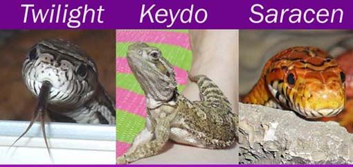
08 male Carolina Corn �Saracen�
09 male Anery Corn �Twilight�
08 male Rankins Dragon �Keydo� |
|
|
|
Sta~ple
qeeun speler

United Kingdom
6129 Posts |
Posted - 30/04/2011 : 17:15:08
|
quote:
Originally posted by Diesel1994
im trying to work on a new logo, for anyone that is interested i will pay �30 for the right logo, and i will have a tweak of the colours, thanks for your help its always nice to get some fresh ideas from a new perspective
I can try and help design a logo after the 6th of June if that is any good to you! Lol! Not too intrested in the money either really although it may end up looking shoddy XD You should def have a colour swatch for you site though before you think of logos or giving anyone else the task of it :)
The site seems fine to me apart from the comments I made, not as pro as Swell but there are some really shoddy ones out there that still make money! Although a note, I am now on a different computer as I can read the black text against the green better, minitors are calibated differently and you just need to test your site on a a laptop, desktop, old chunky pc monitors, interenet phone and on a TV as they all display the colours differently but that happens all the time. It's just picking a good colour that works well with all :)
Yes designing a website is easy, anyone can do it but setting it up so the payment systems work and how picking a good layout and colours is hard, but I think you've done well! I didn't know you were 16, so kudos. I remeber making some at your ages and yours is a lot better than mine, I could never get the payment system working! Are you using dreamweaver just out of curiousity?
I hope things go well for you. I would also offer the tip, I see you have a 10% off voucher at the side of your site although this raises the question, who wouldn't use use that voucher while shopping so why not just take 10% of your prices? Maybe make a kind of sign up/news letter of which, there is 10% off instead of advertsing it :) |
   
A very special super, duper thanks for K :3 |
|
|
|
scubadude
Hatchling
United Kingdom
366 Posts |
Posted - 30/04/2011 : 17:27:43
|
to be honest a good start, my only quible so far, as a bit of an old fart  is the black text on green background is a little hard to read. Good luck with the new venture is the black text on green background is a little hard to read. Good luck with the new venture |
1.0.0 Classic corn snake - Dodge,2.2.0 Normal Royal - Palin,Detritus, Lyssa & Sofia,1.0.0 Spider royal - Anan,1.0.0 Mojave Royal - Ocha,1.0 Butter Royal - Huritt,0.1 Pastel ph ghost - Weeko,0.1 Yellowbelly - Loni,1.1.0 crawl cay boas -Maya & Pech,1.0.0 Hypo hog island boa - Harley,0.1.0 Hog island Boa - Babe
   
   
opinions are like ars*holes, everyone's got one, but you don't need to share them with the world. |
|
|
|
Diesel1994
Hatchling
United Kingdom
338 Posts |
Posted - 01/05/2011 : 17:51:37
|
| Ok guys what do you think to the new colour scheme? not very reptilely I know, would this rut you off? |
Owner of Renza Exotics - www.renzapets.co.uk
For all your Exotic & Domestic pet needs |
|
|
|
Diesel1994
Hatchling
United Kingdom
338 Posts |
Posted - 01/05/2011 : 17:55:21
|
| put* |
Owner of Renza Exotics - www.renzapets.co.uk
For all your Exotic & Domestic pet needs |
|
|
|
Sta~ple
qeeun speler
United Kingdom
6129 Posts |
Posted - 01/05/2011 : 17:57:01
|
| Much easier to read although it does make me miss the green :p |
A very special super, duper thanks for K :3 |
|
|
|
Diesel1994
Hatchling
United Kingdom
338 Posts |
Posted - 01/05/2011 : 18:09:39
|
| haha so green or how it is now? |
Owner of Renza Exotics - www.renzapets.co.uk
For all your Exotic & Domestic pet needs |
|
|
|
lotabob
Fully Grown Corn
United Kingdom
4334 Posts |
Posted - 01/05/2011 : 18:10:41
|
| That really is loads clearer but yeah I kinda miss the green too, lol. |
Anery Corn snake SPOT. Royal Python, DUKE. Hogg Island Boa, SANKE. Albino House Snake, HAL.
Harlequin Crested Gecko HARLEY
Albino Horned Frog WAKA
Chilean Rose Tarantula TRIXIE. Brazilian Salmon Pink Bird-eating Tarantula SAM. Orange Baboon Tarantula BORIS.
Giant Asian Forest Scorpion, SALLY.
Giant African Land Snails, SHELDON & MICHELLE.
Budwing Mantis, MAIA
Dubia Roach Colony. Silkworm Colony. Mealworm Colony. Waxworm Colony. Fruit Beetle Colony.
MY YOUTUBE CHANNEL http://www.youtube.com/user/alocheeky |
|
|
|
Diesel1994
Hatchling
United Kingdom
338 Posts |
Posted - 01/05/2011 : 18:17:57
|
| would it put you off buying from us because the site isnt very themed? |
Owner of Renza Exotics - www.renzapets.co.uk
For all your Exotic & Domestic pet needs |
|
|
|
Sta~ple
qeeun speler
United Kingdom
6129 Posts |
Posted - 01/05/2011 : 18:18:22
|
| Um like a compromise between the two...like a pale not so saturated green? You culd always do an easy test by taking a screen shot of your page and uyusing the fiull tool on the backgrouns with something like MS paint. |
A very special super, duper thanks for K :3 |
|
|
|
Topic |
|